Overview
Lupin Limited is an Indian multinational pharmaceutical company based in Mumbai, India. It is one of the largest generic pharmaceutical companies by revenue globally.
Lupin partnered with Velocita to create its first ever Integrated Report. With this Integrated Report design we helped launch Lupin’s brand vision, values and strategic framework to customers and investors.
Case Timeline
2021
Brand
Lupin | Report Design, Brochure Design
Background
In light of the global pandemic, organisations around the world were trying to cope with the change. Some coped, some didn’t. Lupin’s resilence as a business shone through backed by it’s leadership team and it’s global workforce.
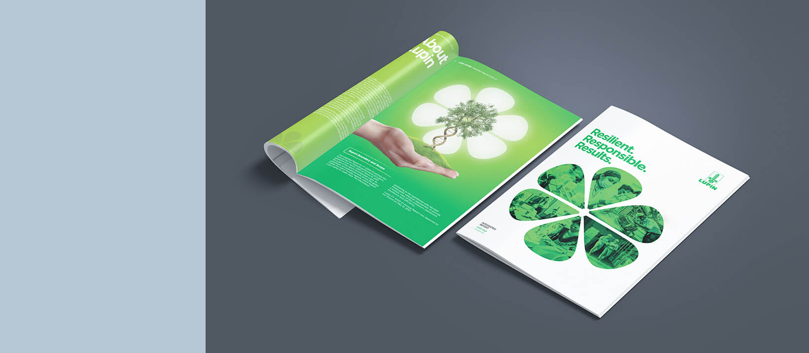
The report design focused on the theme —Resilient. Responsible. Results.
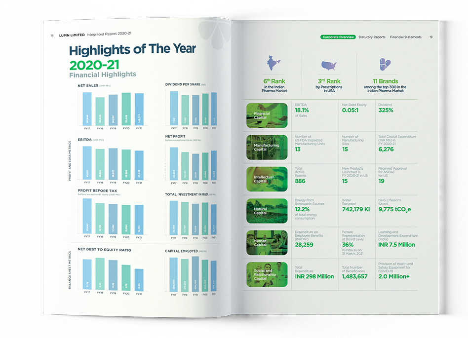
An exhaustive data set
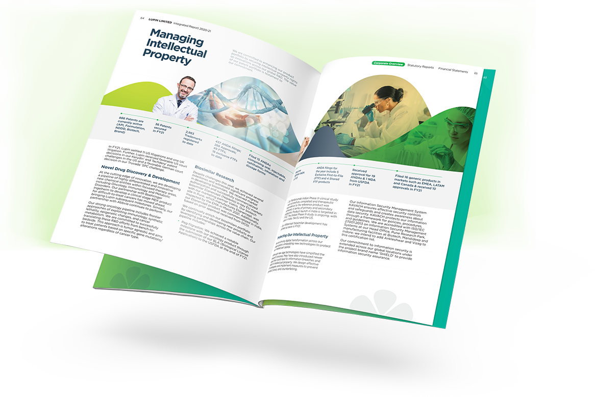
Our report design strikes a balance between 322 pages of total data and 90 pages of data-rich content with engaging imagery and copy that brings human resilience to the surface.
Design style
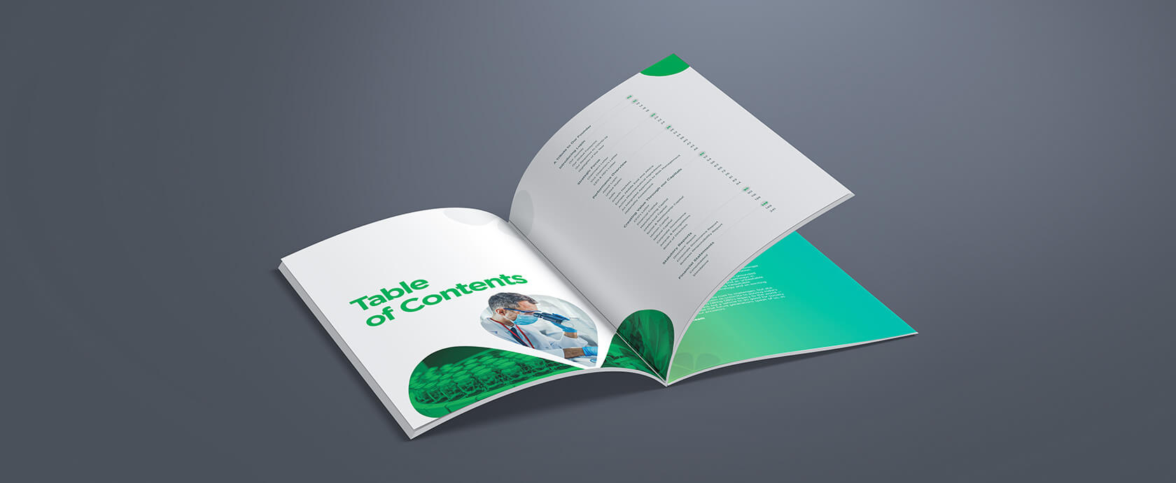
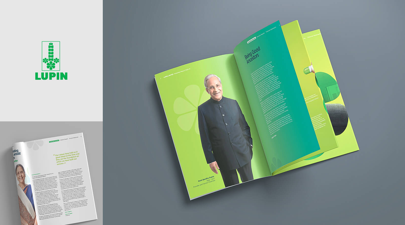
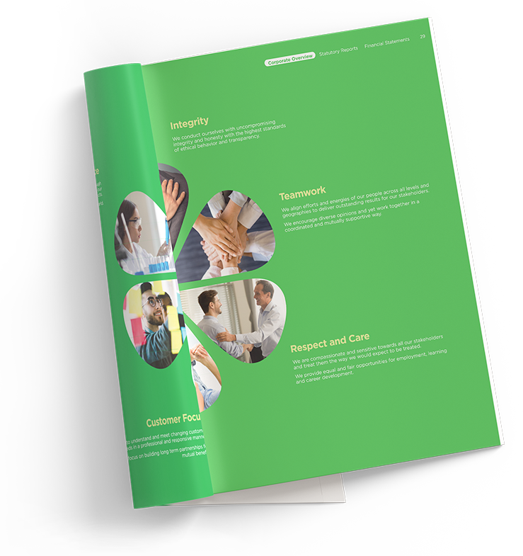
To keep readers interested, we introduced different treatments for the wide range of imagery: hero images are shown in full colour with green accents, with smaller ones using duo tone and the Lupin flower to avoid distraction from the content around them.
Demonstrating resilience
amidst challenges
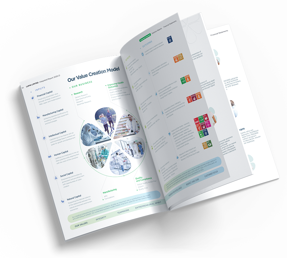
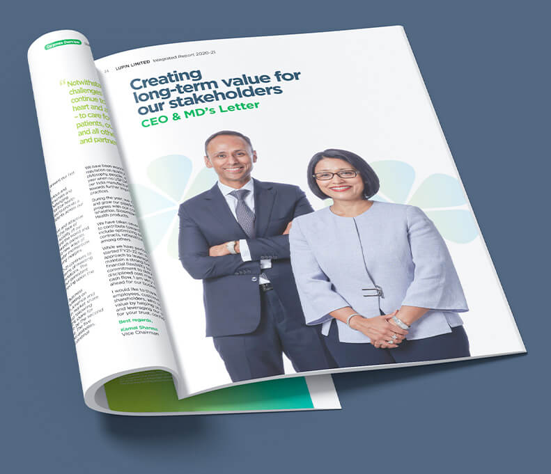
This Lupin 2020-21 Integrated Report design represents the first experience of the Lupin brand for many of its audience since Covid-19. It includes details about each of the leadership team members and gives an ample glimpse of how Lupin has coped with the tumultuous changes in the last year and came out ahead. It also covers Lupin’s Ethos, Strategic Framework and Value Creation Model.
Key design elements
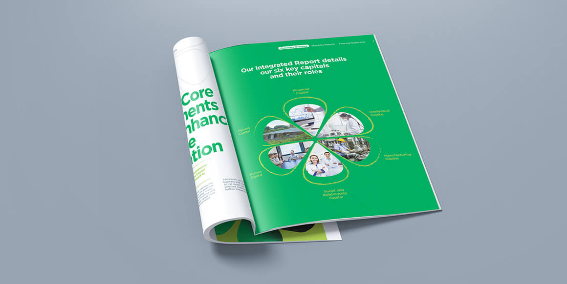
The shape of the Lupin flower was one of the primary design elements used especially for the core Lupin values. It was also used to present the variety of industries and clients supported by Lupin’s healthcare and its applications in research. We even used the shape to insert images across key pages, adding a sense of continuity throughout.
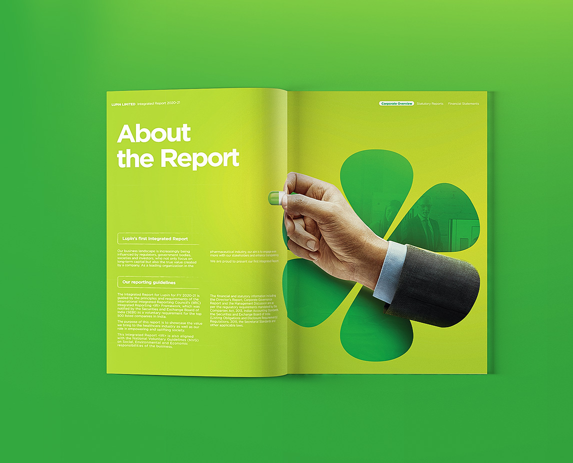
We created a unique set of icons and added a satisfying gradient effect in Lupin’s primary brand colour- green, adding to the brand integrated look and feel of the brochure.