Overview
Suroj today is recognized as one of India’s leading civil engineering construction companies, providing services to reputed MNCs, Indian Conglomerates and Government sectors.
Armed with a vision to become the most preferred civil construction company and make the best contributions in building a new India, Suroj approached Velocita to be its creative partner and revamp its brand guidelines, corporate identity and aid them in their social media marketing.
Case Timeline
2018 – Present
Brand
Suroj | Corporate Identity, Stationary, Brand Guidelines, Styleguide, Marketing Collateral, Social Media Marketing, Videos
Brand Discovery
A brand discovery exercise with the leadership team and other stakeholders helped us get the ball rolling and gather insights that shaped our creative direction in developing a unique and effective brand identity for Suroj.
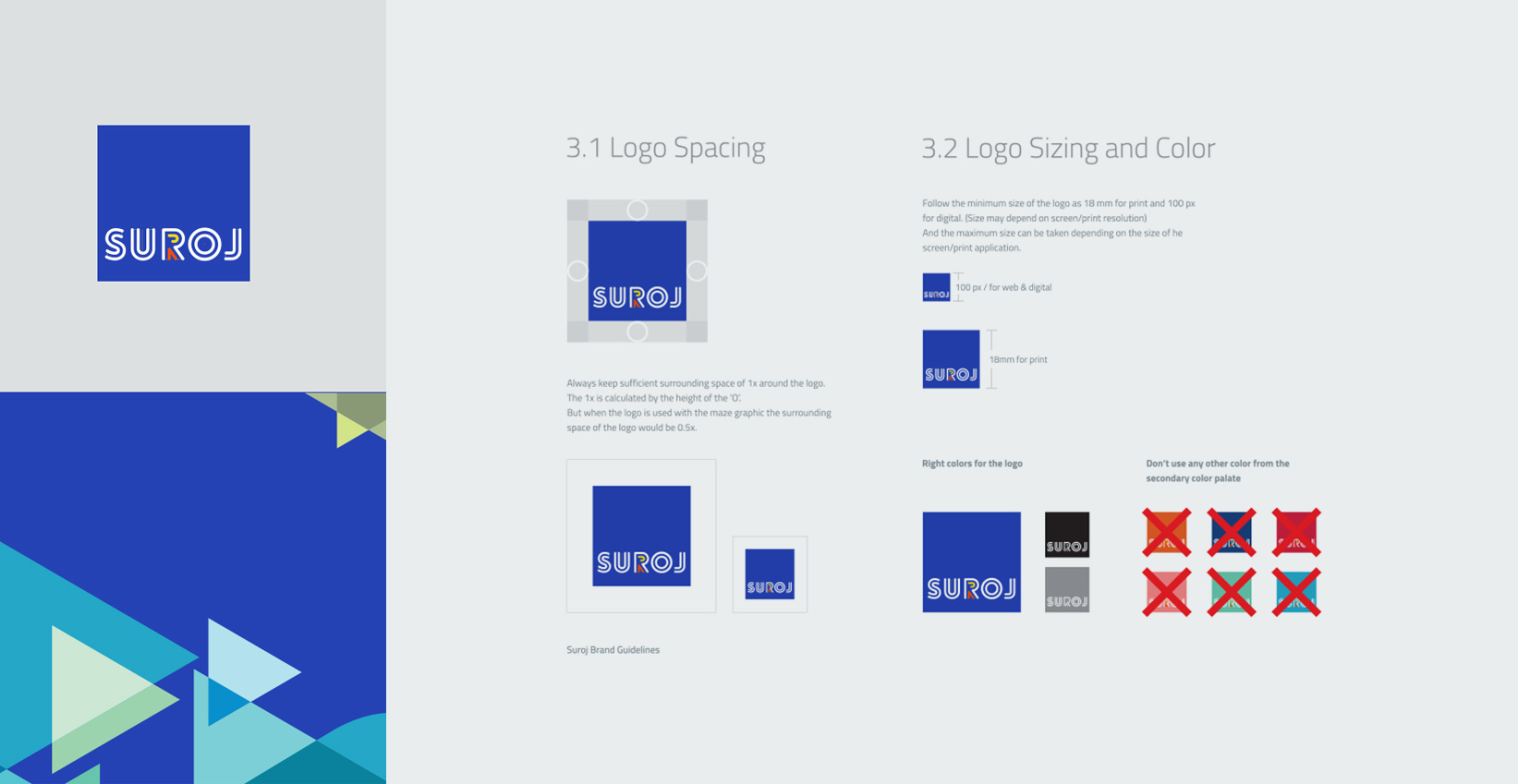
The new logo
The logo mark was derived from the company’s name and rendered to show Suroj’s attributes as well. The double lines used denote the added strength that they bring to every project, while the dot in the ‘O’ is placed to depict a bull’s-eye, to show they strive to achieve their project or organisational goals, every single time.
Font
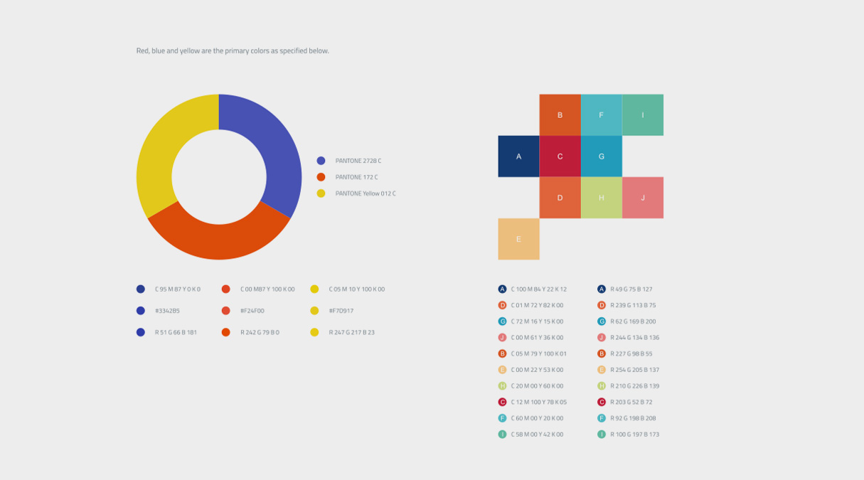
Suroj’s typographic style – font, color, scale
and weight – are a big part of what makes the brand visually distinctive and recognizable, and hence should be used consistently across all media and collateral.
Suroj’s overarching Cairo typeface was chosen as it is a variable font from a contemporary multilingual typeface family
Cairo balances classic and contemporary tastes with wide open counters and short ascenders and descenders that minimize length while maintaining easy readability. The lighter weights were used for body text while the heavier weights are perfect for headlines and display typography.

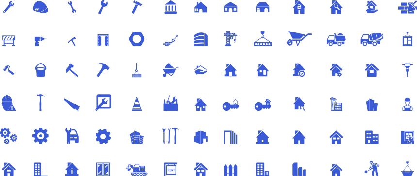
Icons
Icons are interspersed throughout our written communication to break the textual monotone and enable readers to imbibe the information quickly and succinctly. We’ve given an example of the style and type of icons to be consistently used for Suroj collaterals.
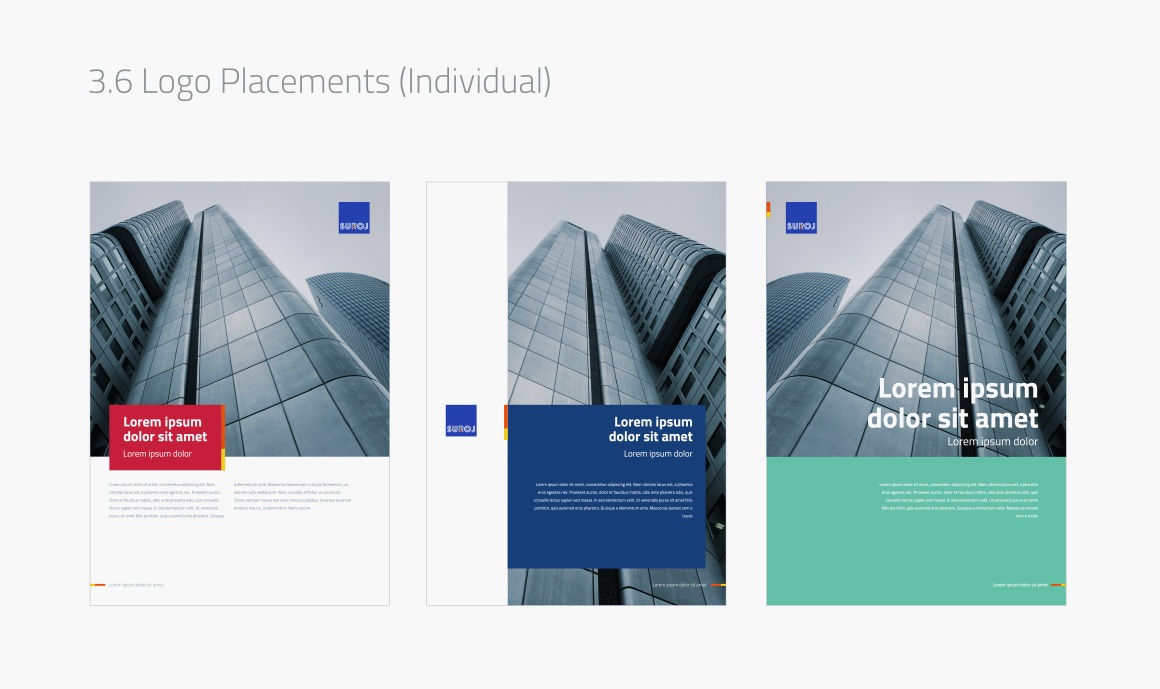
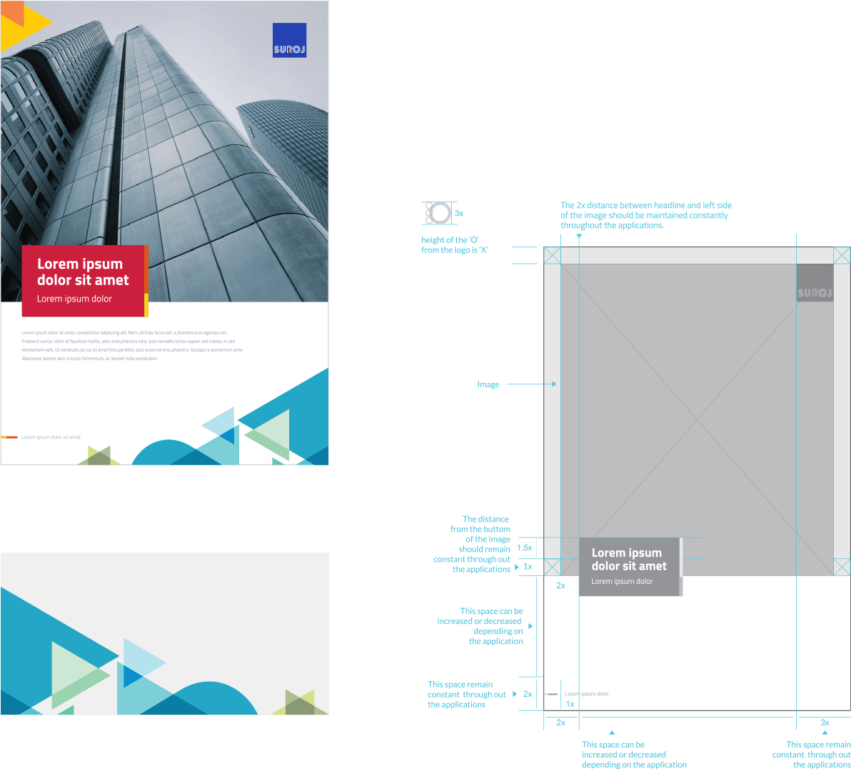
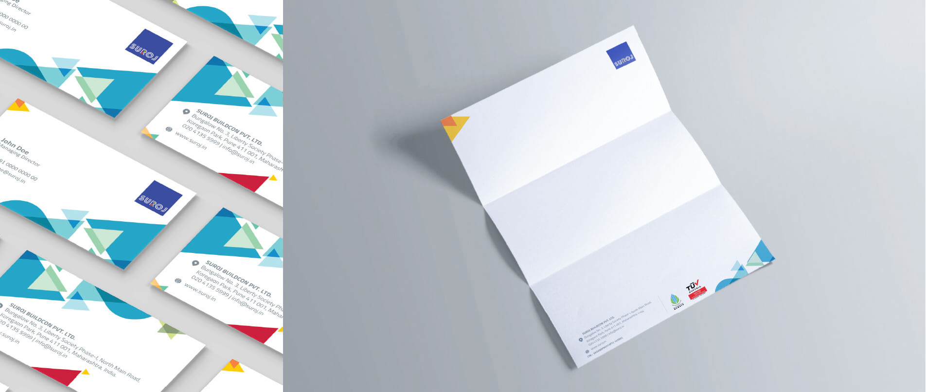
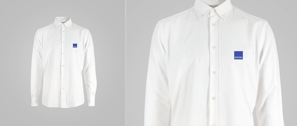
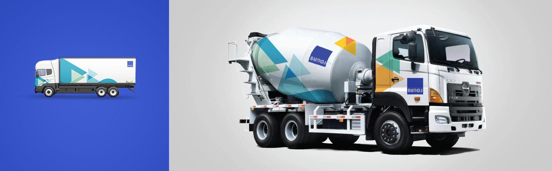
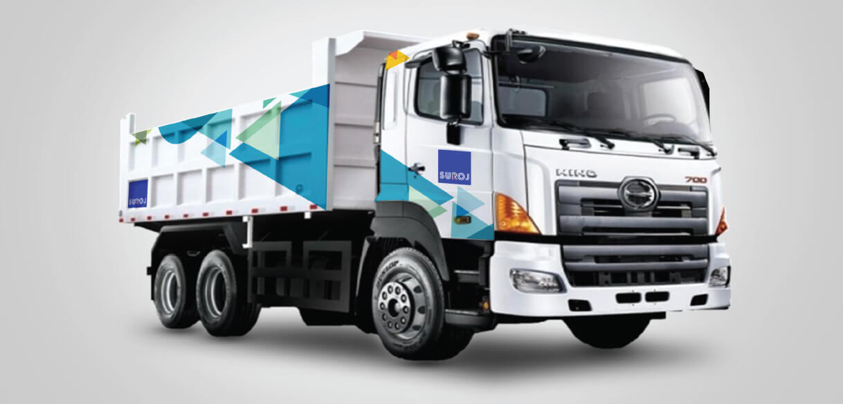
Captivating layout designs
To unify the look and feel across material, we chalked out the layout across communication collateral to be followed with our core elements and colours on it right from a flyer to signages to merchandise to employee kits and cards.
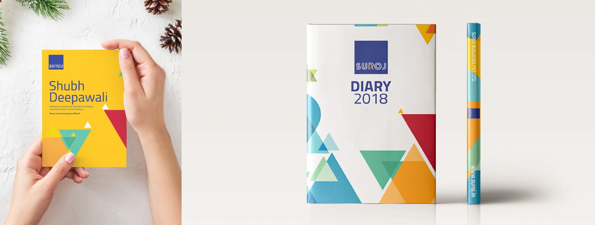
Diary and brochures
Our design and content team advised Suroj on the best content strategy – a variety of layouts, visual styles and ways to tell stories, grab readers’ attention from the cover page. Warm illustrations, branded design elements and vivid adventure sports images evoke the feeling of freedom that travelling and adventure inspire.
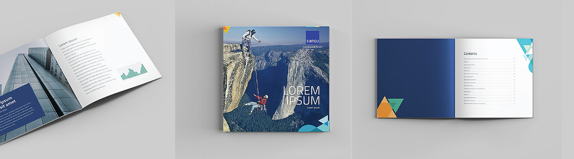
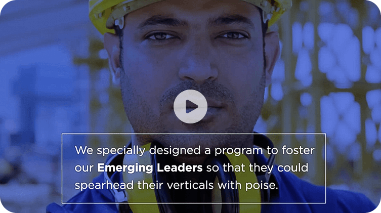
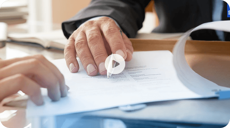
Photography
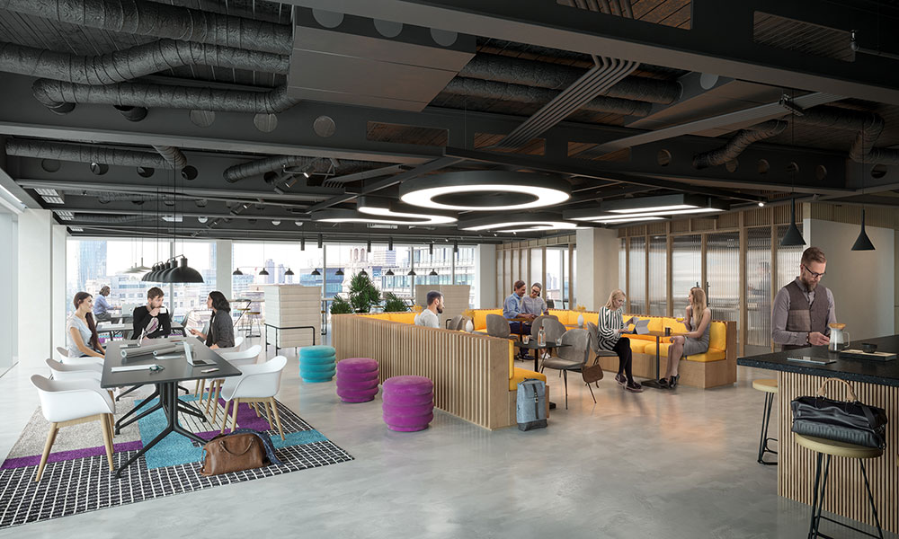
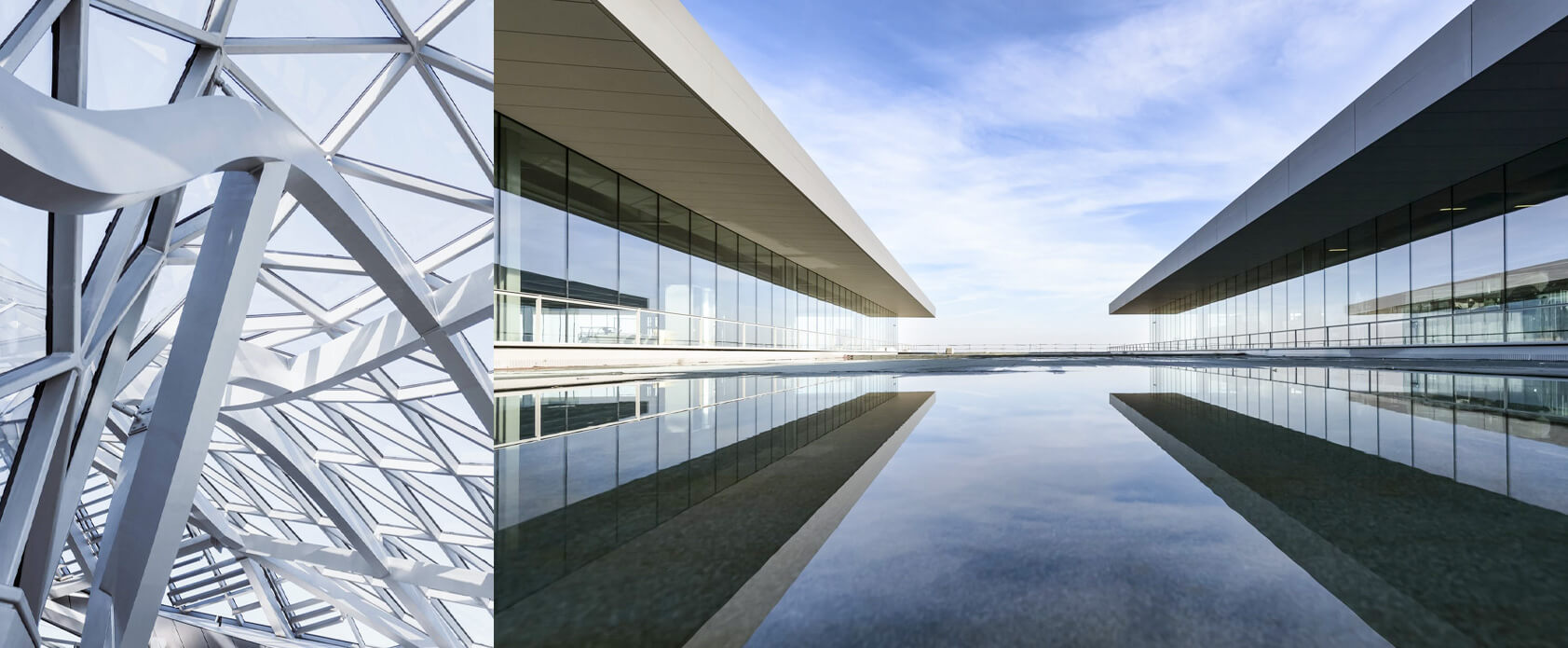
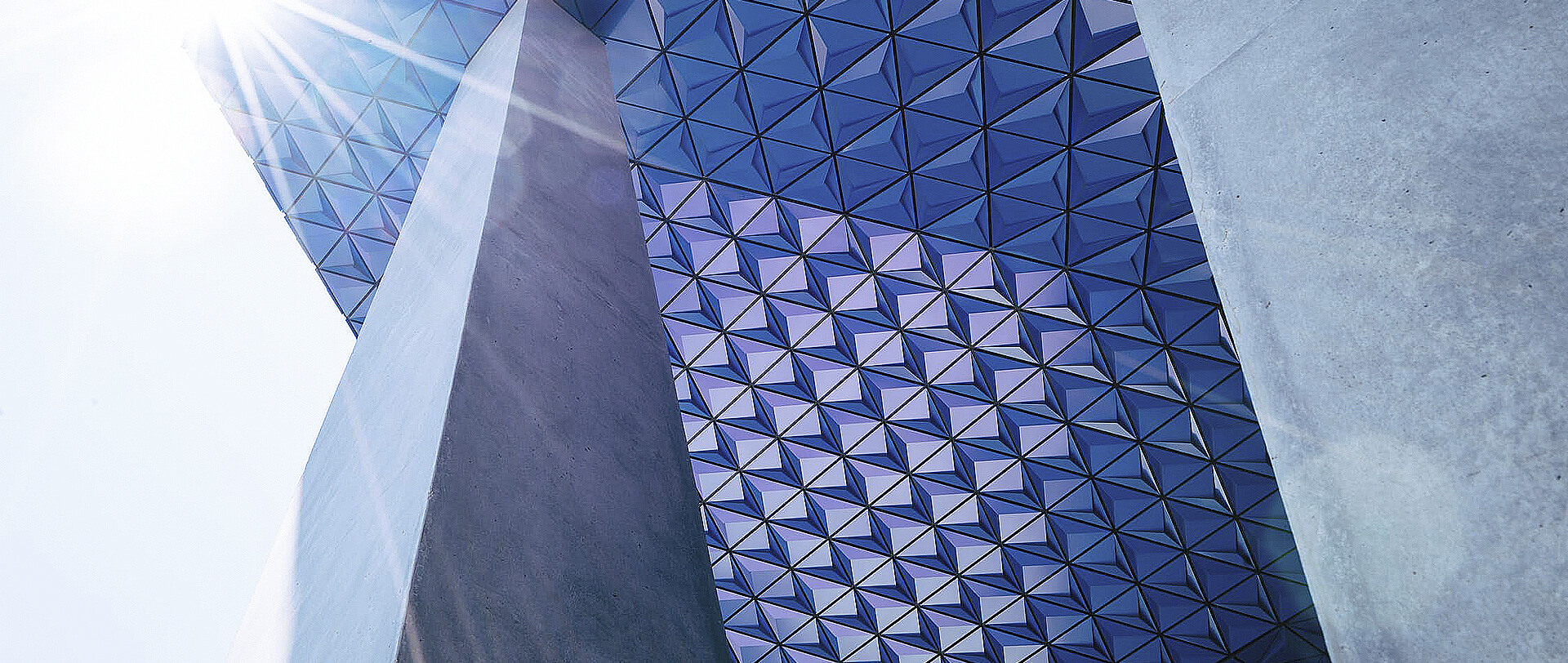
Our choice of photography expresses the honest, authentic, passionate and traditional side of our brand’s personality while simultaneously combining it with our future-forward approach.
Images selected reflected Strength, Flexibility and Trustworthiness. To add an element of reality to our interactions, our pictures should essentially show communication pertaining to the real world; this means representing people, places and situations in a manner that’s honest and insightful.

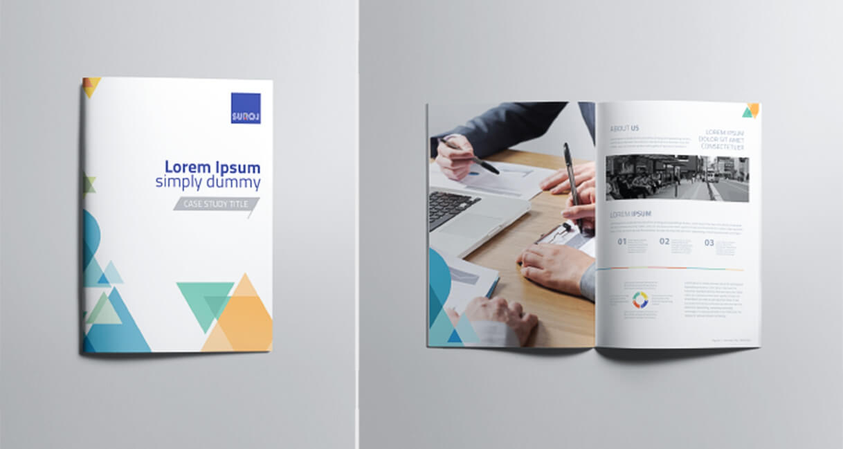
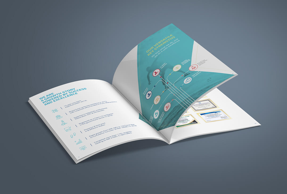
Marketing collateral design
We also created a corporate brochure, corporate presentation, project brochures and internal communication collaterals for the brand.
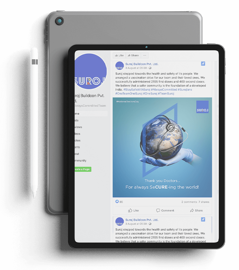
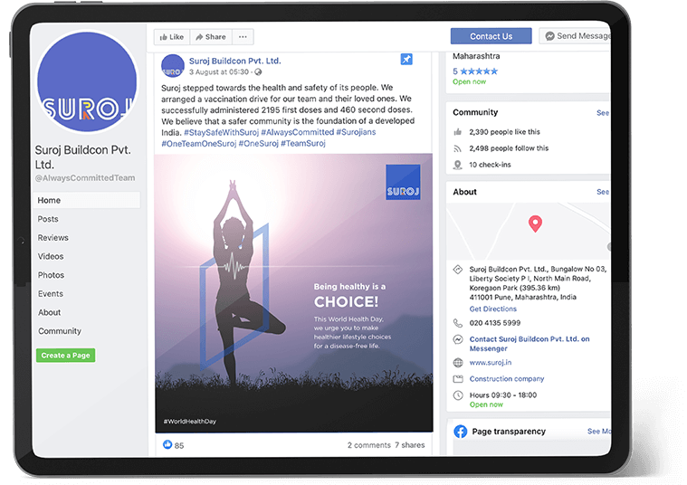
Social media marketing
Social media is a hugely important and influential tool for Suroj in its efforts to create awareness about the brand. We’ve been their social media marketing partner for close to a year. We’ve grown their overall audience by atleast 5% per month in that period.
As part of our engagement, we’ve helped create all the creative assets that are displayed on Suroj’s social platforms— Linkedin and Facebook. From project updates to team celebrations and company milestones, we create impactful designs via company branded static or video content that is giving their online audience a glimpse of the brand.